


Trains
When I was a teenager, nothing came close to the rush of painting trains. From 13 to 16, that was the life—real excitement before you even hit the yard. First challenge? Getting paint. Back then, nobody bought spray paint—you racked it. Hit up spots like Martin’s Paint or Pearl Paints in Manhattan, stuffing bags or jackets and hoping not to get caught.
Then came the caps. You needed the right ones to get the flow and speed—'Fat Caps' were prime. We’d yank them off Jiffy Foam oven cleaner or Niagara spray starch cans. It was all about moving fast. Time wasn’t on your side with the Vandal Squad creeping.
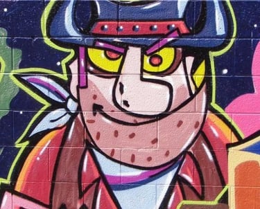
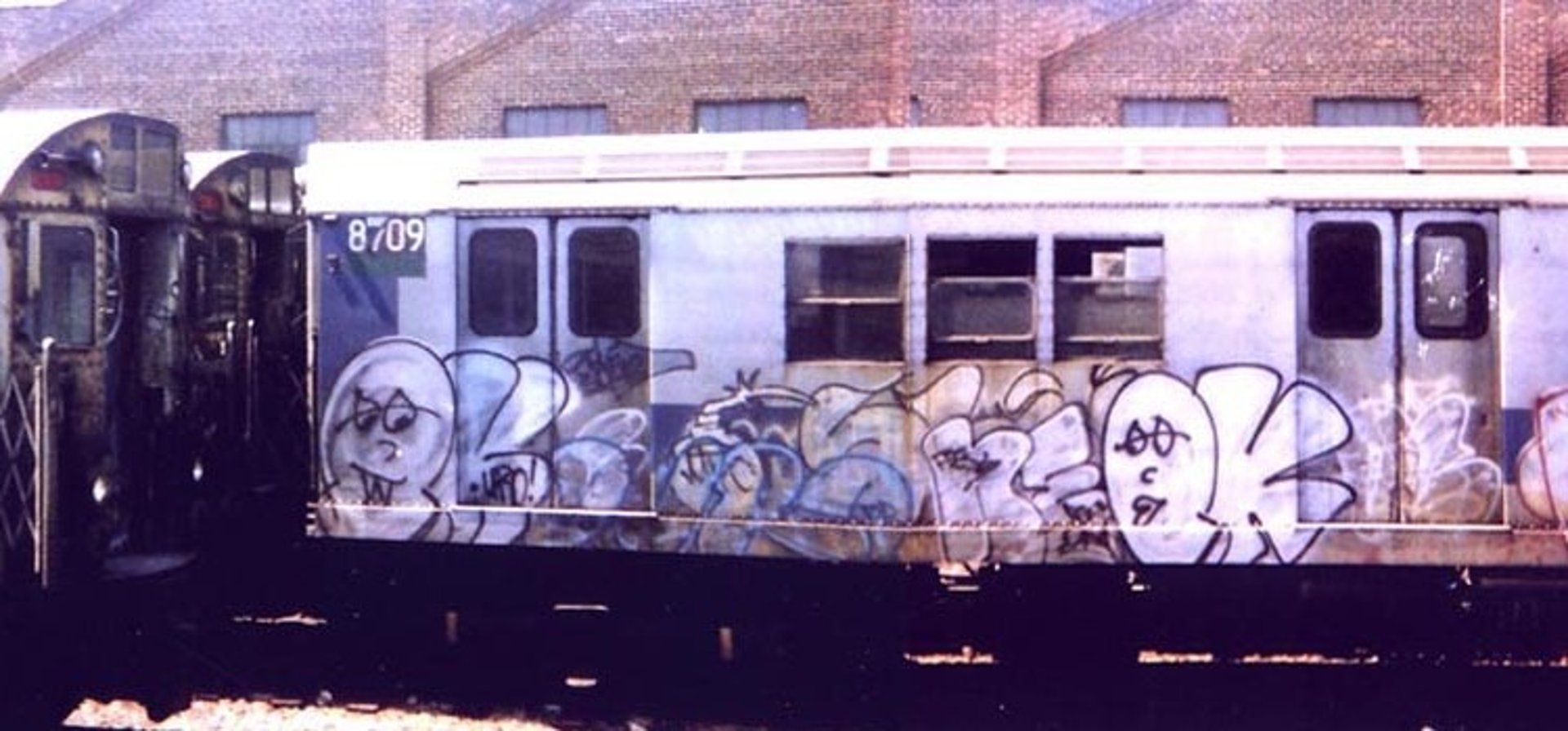
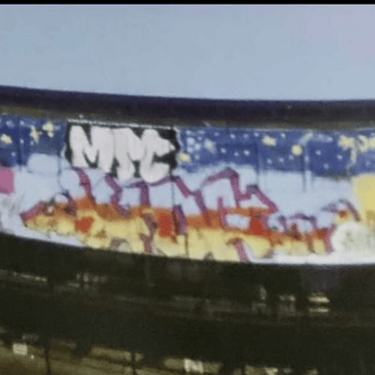
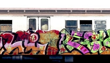
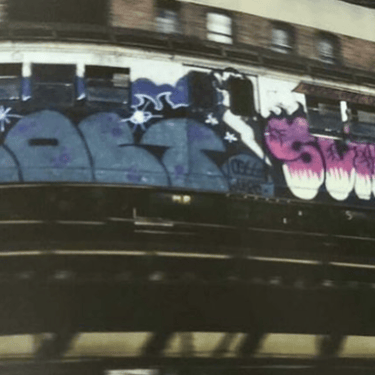
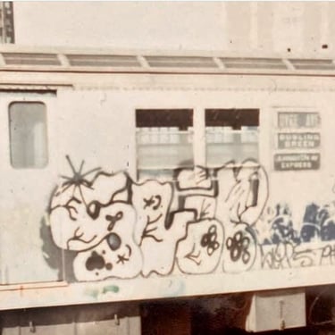
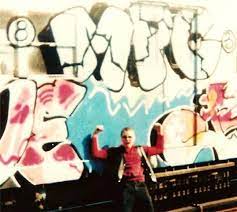
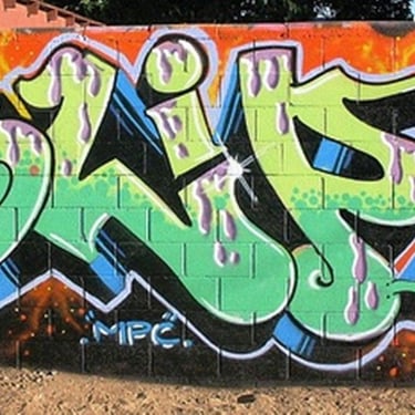
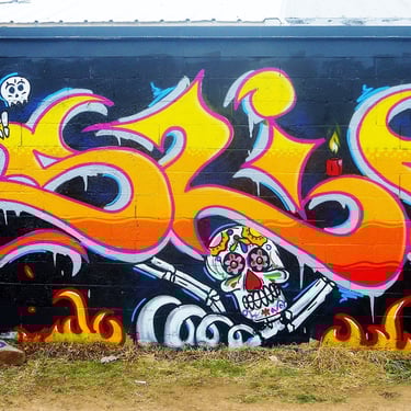
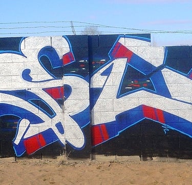
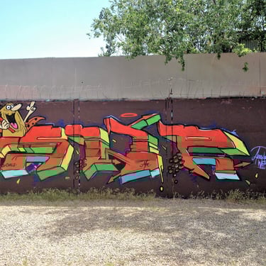
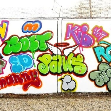
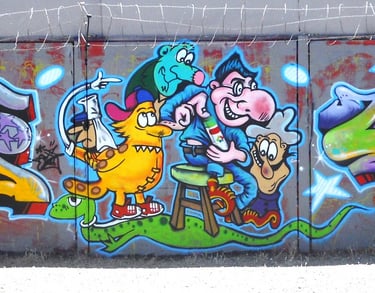
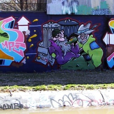
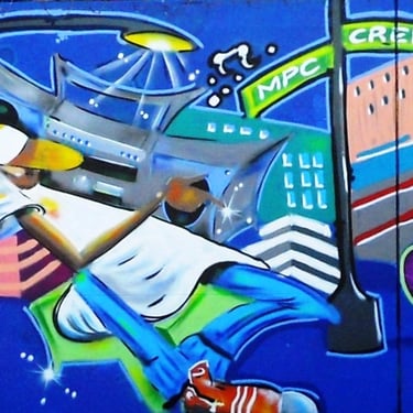
Once you made it into the yard, it was go time. You and your boys would put up your plan—whether it was a fast 'throw up' just to get your name up, or a full-blown burner with characters and a theme. Sometimes you’d run into other crews—could be beef, could be respect, but it always added to the thrill.Back then, crossing someone out was the game. As pictured QUICK, RTW, DURO, and MIN over SLIP, MPC. Just another day in the war.
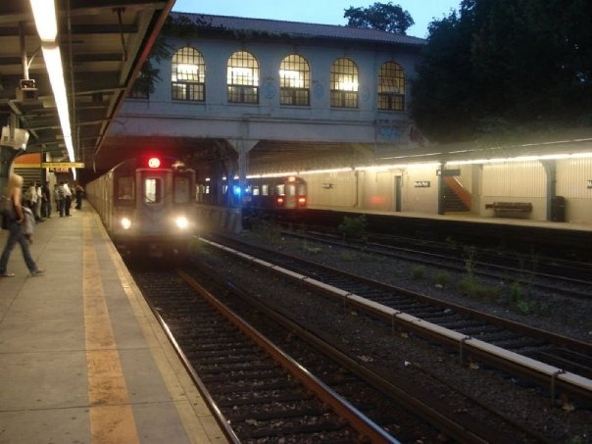
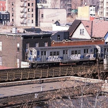
The best part? Seeing it ride. After the flicks were taken and the adrenaline wore off, you waited. That train rolling through the boroughs with your name on it—it was like your signature on the city. That’s where ‘benching’ came in. You’d post up at the layups or the spots and watch for your work—or your boys’—to cruise by. That was our fame, five minutes at a time.
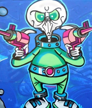
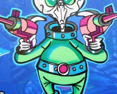
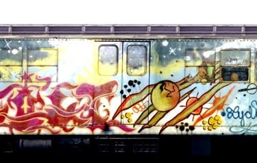
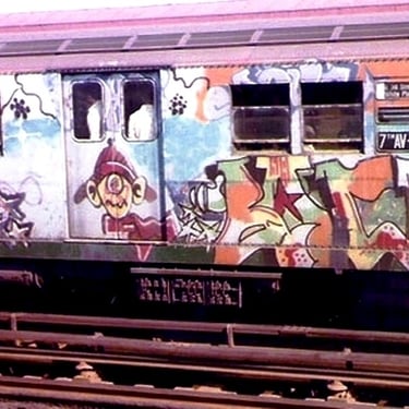
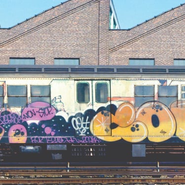
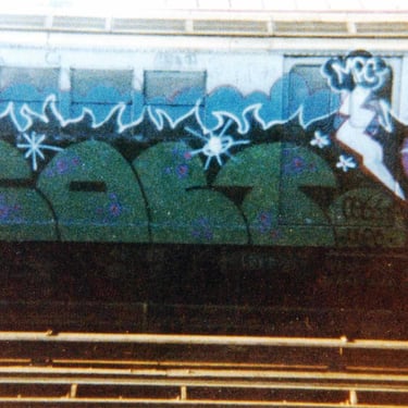
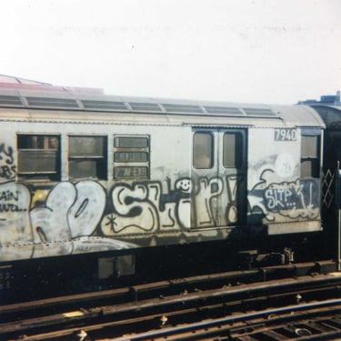
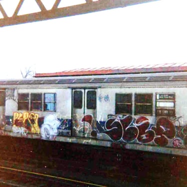
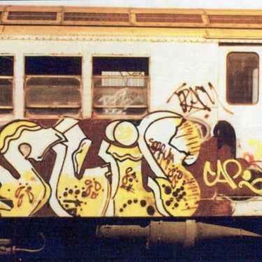
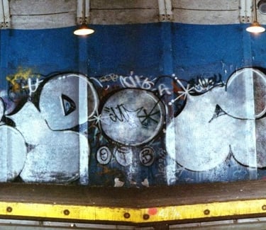
A quick note: Most of the shots here are thanks to Henry Chalfant—Style Wars, Subway Art classics. One low-res whole car with “John Boy” and MPC cloud/bolt above the 1979 Colt-Slip piece came from Martha Cooper’s latest book, Spray Nation. I’m pretty sure I rocked that one when Colt did his Planets train—same sky fade, same color vibe. I’m still hoping to track down high-res shots. If anyone’s got a photo of that Colt-Slip before it got crossed out—especially from the elevated line—or any of my other trains, reach out. I’ll make it worth your while. Thanks.

Graffiti Letters
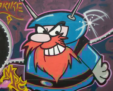
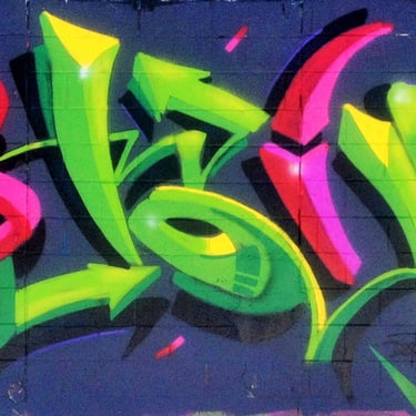
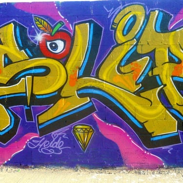
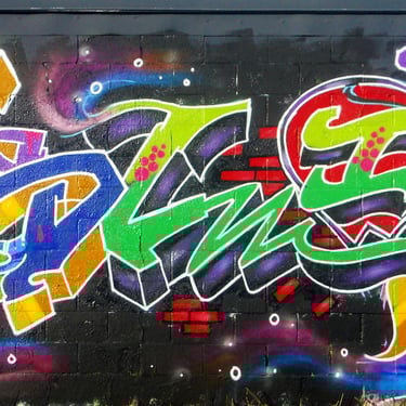
Graffiti writing places significant emphasis on letters, with the journey from a simple tag to elaborate letter structures marking a substantial transformation.As a 13 year old I adopted the pseudonym "Slip," drawing inspiration from the Bowery Boys series.
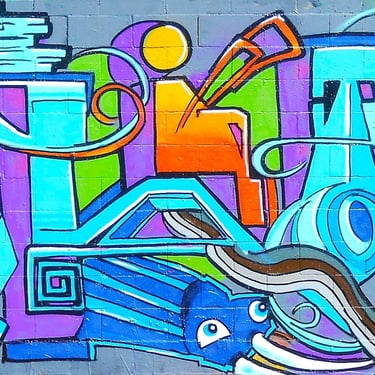
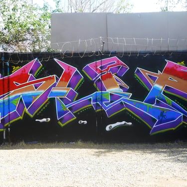
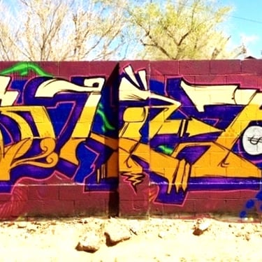
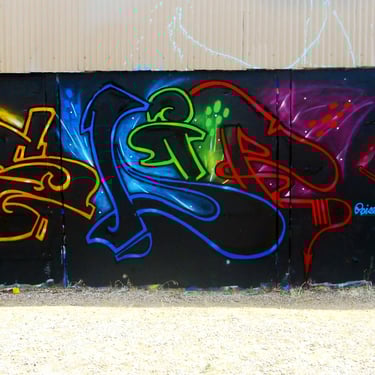
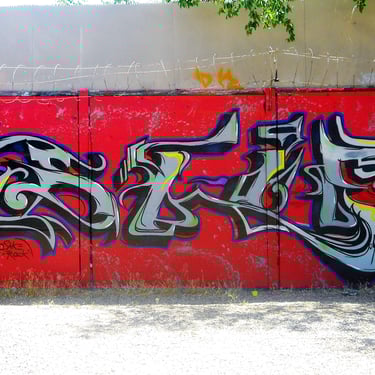
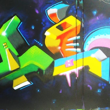
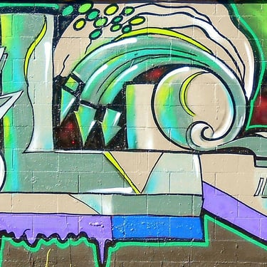
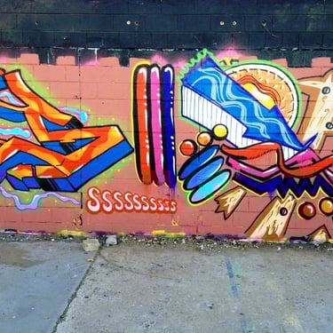
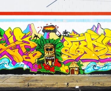
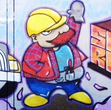
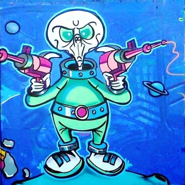
Today's graffiti and street art showcase a remarkable advancement, evident in both the skill level and the use of low-pressure paint. The progression of letter styles has shifted from basic, straight letters with shadows and 3D effects to intricate wild styles that incorporate various additional elements around each letter.
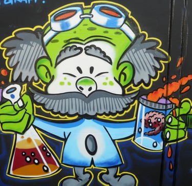
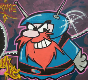
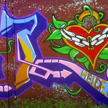
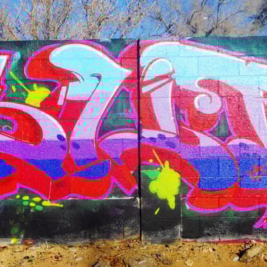
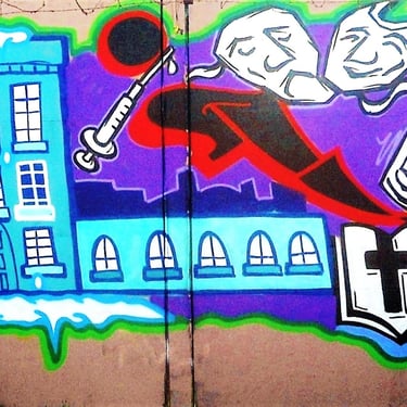
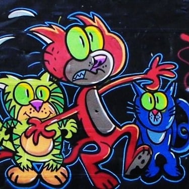
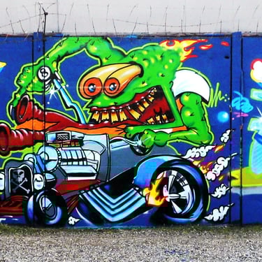
These elements often include bits, arrows, and, if the artist is ambitious, accompanying characters. While repeatedly inscribing one's own name may become tedious, my approach has been to prioritize legibility and think creatively beyond conventional boundaries. Here are a few collaborations and solo pieces.
2024 John F Lorne All Rights Reserved